Concertina book research: displaying and presenting

Research for displaying the concertina in my original idea of a star shape. The above layout would be more appropriate for my design, as it allows for all pages of the piece to be seen. The fastening of the book in the lower image doesn't allow for some pages to be seen, so would not be ideal as a method of installing. However I really like the design and colours used in this piece, especially displayed against a dark background.
For this display the prints on the inner pages are quite hidden, which would create difficulty for the audience when viewing the piece.
For this display the prints on the inner pages are quite hidden, which would create difficulty for the audience when viewing the piece.
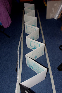
The open format, which is my current idea for display. This will make it easier for viewing, as the audience can see all off the images clearly. The table will be made of a thin plank of wood, and supported by breeze blocks to be in keeping with the degree show theme"Grit".
The viewer will be able to see each print in close detail now, and with more ease so this display is much more appropriate for my work.
Researching other artists books displayed in an open format, a common background colour for the work is white which doesn't detract from the piece.
These books are largely printed on one side, which is easier to display from one angle.
This is the piece of wood I'm going to display the piece on, today (21/05) I cute it down to the right length, and sanded the edges and surface to give it a nice finish.
I've decided to not paint the board as I was considering to, since I think this will also be fitting for the theme of the exhibition.


No comments:
Post a Comment