Thursday 30 May 2013


Installing work in the studio

 A few images taken yesterday (29/05) experimenting with how many breeze blocks to use for the stand. I decided that five was nice, as it's quite low so not too invasive. I originally wanted it to be waist height but realised that it doesn't need to be that high for the audience to see it. 

Currently waiting to set the work up properly as other students are using the studio so I don't want to risk damaging the piece if left open. 


Printmaking research

William Kentridge


  • Interesting line work and shading, very emotive imagery and accompanying text.
  • I love the detail of this work, the text echoes the title of the pieces and is quite haunting in it's appearance.


Jeremy Youngs

The linear style of this work is similar to my own.


Victoria RumiancevaitÄ—s


  • Interesting print and book work, I like the piece below which is like several books with different images.
  • Innovative the way it fits together to create a larger image, and I like the way it grows out of the wall to meet the viewer.


Jake and Dinos Chapman
Exquisite Corpse

I have always been interested in the work of the Chapman brothers, and have researched them in previous projects due to their sinister and macabre style.


Tuesday 28 May 2013


Pictures and Words, by Roanne Bell and Mark Sinclair

An interesting book which includes multiple styles of illustration, I have been using this for narrative research for FMP. This is where I found Andrjez Klimowski's The Dream Depository, which appealed to me due to the wordless narrative. (below).


Fredrik von Blixen's Lost and Found

In this work I really like the intricate style of illustration used within this narrative, since I find this akin to my work. I also like the minimal line of text below the illustrations, which allows the reader to focus largely on the imagery. The text is dreamlike and a little disconnected from the imagery, but reads like a poem with the added dimension of the images. The combination of text and image does not necessarily allude to a strict answer or interpretation, and the viewer is left to consider their personal interpretation. Lost the second part, and Found the final in a trilogy that still requires a first instalment. It's interesting how the parts have been released in this order, I feel it creates an impressionistic air about the work since one would have to rely upon their own assumptions regarding the story.
"It began as an intention to conclude what my notion of 'lost' is" says von Blixen. "However, I'm still looking for it and the moral of the story changes every time... I suppose I lost my head and found a box of 'ifs' and 'ors' that will never stop bothering me".


In Silence by Anna Bhushan

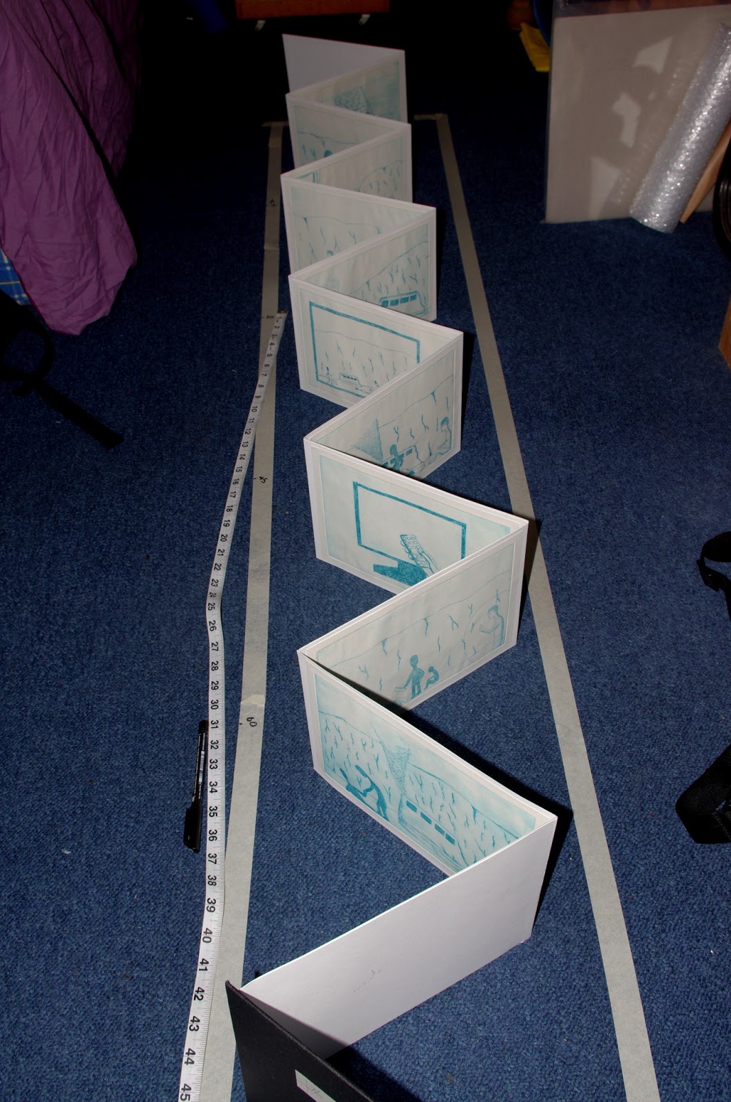
This image is taken from the book We Lie Together which was written in collaboration between Bhushan and fellow Royal College of Art graduate Laura Carlin. The project was to create a book within a book, which upon first reading shows an idyllic domestic environment through Carlin's images with words enhancing this. The book is French-folded, so after reading through the reader can tear open the pages along the folds to reveal Bhushan's images, which completely invert the meaning of the story. The second set of images are silent, like the panel left, and create a heavily emotive narrative. I like the very flat and linear two dimensional style of illustration; it reminds me of my own prints. 


Martin tom Dieck: La FM and Untitled

Left is the silent third part of La FM, which has been left as an enigma by the author. The colour scheme of this work really appeals to me, and I appreciate the combination of painting and drawing. Despite probably being unrelated in context and style it reminds me of The Depository, as it begins with a man sat by his desk who seems to be stuck on something. The contrast of the colours work really well together, and it's interesting to see that only a limited colour palette of red/black/yellow has been used. Through this Dieck creates a very striking narrative.
This story was left un-named in the book, and was originally published in Die Zeit magazine. The dreamlike nature of the story can be attributed to the content of the sequence, which was "built around the moment between sleeping and waking and the attempt to make this moment last". Again his work reminds me of Klimowski's work, but this time it is due to the contrasting black and white of the frames. Dieck uses minimal text to express whimsical thoughts of the character, for instance in the fourth panel "Alas, those old songs," and seventh "What, however, do we know under water?" In the story the main character is shown to be gathering all of his smaller "selves" from his floor, whilst in a hypnogogic state.


Monday 27 May 2013


Final sequencing of prints

This is the final sequencing of my images, adapted from another sequence with some scenes rearranged to make the narrative more fitting. I devised it through thinking about how I first remembered the dream upon waking; which was the ending of the dream and leaving the island with Anthony and Ross.


From scenes two to twelve I wanted to display a mixed account of remembering being on the island and watching everyone's panic, juxtaposed with just watching these events through a TV. I aimed to make this as logical as possible in terms of how I remembered it, which involved some events taking place in reverse order (for example remembering watching the TV show, then remembering turning the TV on). 

A couple of prints were kept in their original order like nine and ten (the top two in the above image, 'going into' the TV) which I felt conveyed the pivotal moment in the narrative when the dream completely switched realities, and if displayed in a reversed order I felt this would not be clear.


Images thirteen through to twenty-one show me leaving the group of island survivors to explore the island, and finding Anthony and Ross which led to leaving the island on the bridge. I continued the method used earlier in the sequence; of switching  the chronological order  of the dream according to the order it was remembered.


The last image in the sequence was originally the first image; sat talking with friends before beginning to watch TV.  I chose to put this last after reordering the sequence since this was the last thing that came to me after remembering the dream; almost as a clarification of how the dream began. The second to last image was originally the last image in the sequence, and I think it was good to place these two images together since it sandwiches together the beginning and end of the sequence, and creates a sense of overall unity within the narrative.

Tuesday 21 May 2013


Updated Degree show proposal


Final piece: a concertina book which will measure 19cm x 24cm page size, and 6.24 metres in length. To be presented in an open format, on a long and thin table which measures 83 inch long by 12 inch wide. An example of the space and how it will be arranged.


Materials: Either wood or perspex plastic, which can be made in a workshop. Will be supported by wooden studio trestles or discreet table legs.
Preferably in the dark space with some overhead lighting to emphasise the piece.


Concertina book research: displaying and presenting


Research for displaying the concertina in my original idea of a star shape. The above layout would be more appropriate for my design, as it allows for all pages of the piece to be seen. The fastening of the book in the lower image doesn't allow for some pages to be seen, so would not be ideal as a method of installing. However I really like the design and colours used in this piece, especially displayed against a dark background.
For this display the prints on the inner pages are quite hidden, which would create difficulty for the audience when viewing the piece. 
The open format, which is my current idea for display. This will make it easier for viewing, as the audience can see all off the images clearly. The table will be made of a thin plank of wood, and supported by breeze blocks to be in keeping with the degree show theme"Grit".
The viewer will be able to see each print in close detail now, and with more ease so this display is much more appropriate for my work.

 Researching other artists books displayed in an open format, a common background colour for the work is white which doesn't detract from the piece.


These books are largely printed on one side, which is easier to display from one angle.


This is the piece of wood I'm going to display the piece on, today (21/05) I cute it down to the right length, and sanded the edges and surface to give it a nice finish.
I've decided to not paint the board as I was considering to, since I think this will also be fitting for the theme of the exhibition.